
Table of Contents
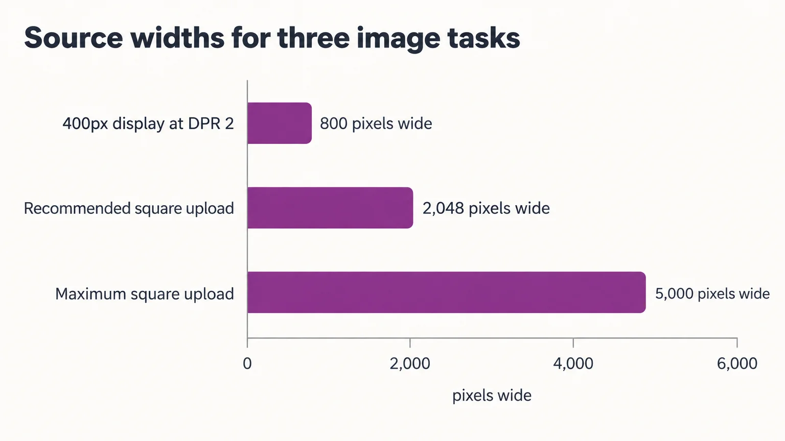
The recommended Shopify product image size is 2048 × 2048 pixels for square photos, according to Shopify’s image size guidelines. Square is a starting point: choose a ratio that works with your theme before setting export dimensions. Shopify’s product-media documentation permits up to 5000 × 5000 pixels or 25 megapixels. Keep files smaller than 20 MB, within Shopify’s file upload limits. For clothing, the goal is sharp detail without cropped hems, shoes, or sleeves.
Before you start, you’ll need theme-editor access, complete source photographs, an editor with canvas and proportional-resize controls, and browser developer tools.
Choose a Shopify product image size and ratio for clothing
Choose one featured-image ratio that works with your theme for products sharing a grid, then set the pixel dimensions. These recommended exports suit common apparel layouts.
| Apparel | Ratio and example export | Compatible card layout | Subject scale | Crop risk |
|---|---|---|---|---|
| Full-length dresses | 4:5, 1600 × 2000; or 2:3, 1600 × 2400 | Matching portrait card or compatible Adapt setting | Taller framing allows a larger full-length subject | Hems and shoes in shorter cards; use side padding for square |
| Tops | 1:1, 2048 × 2048; or 4:5, 1600 × 2000 | Square or matching portrait card | Keep torso size comparable across products | Wide sleeves and extended arms |
| Accessories | 1:1, 2048 × 2048; or 4:5, 1600 × 2000 | Square; portrait for long items | Match visual prominence, not physical product height | Straps, handles, and long ends |
| Flat lays | 1:1, 2048 × 2048; or 4:5, 1600 × 2000 | Match the arrangement’s ratio | Keep outer margins comparable | Sleeves, trouser legs, and arrangement edges |
Ratios describe width:height; pixel dimensions specify resolution. A 1:1 image has equal sides; a 1600 × 2000 export has a 4:5 ratio. For lighting and capture preparation, use our ecommerce product photography guide.
Separate upload sizes, delivery targets, and limits
Your upload is the source; the browser usually receives a resized version. Aim for a delivered file under 500 KB where quality allows, but treat this as a performance target, not a Shopify upload restriction.
| Asset | Upload starting point | Width:height | Storefront delivery | Optional delivered-file target |
|---|---|---|---|---|
| Main product photo | 2048 × 2048 square, or selected portrait export | Shared grid ratio | Responsive rendition from source | Under 500 KB where quality allows |
| Product thumbnail | Reuse product source; 800 × 800 is a square rendition example | Match thumbnail container | Smaller rendition from the shared product source | Set after testing thumbnail clarity |
| Collection cover | 2048 × 2048 as a practical square starting point | Match collection-list cards | Theme-controlled size and crop | Set after measuring the section |
| Banner | Use documented theme-section dimensions | Match banner container | Section-specific crop and focal point | Set after testing mobile and desktop |
Megapixels measure total pixel area. Check portrait exports against both the pixel-dimension and file-size limits before uploading.
For banners, follow your theme’s section guidance and test how it handles the focal point.
1–2. Inspect your theme, then select one featured-image ratio
1. Inspect the active theme. Check the collection-card ratio, image-fit behavior, hover images, product-gallery presentation, and zoom independently.
Shopify’s Dawn product-card code defines these card proportions:
| Dawn setting | Width:height | Effect |
|---|---|---|
| Square | 1:1 | Equal-width-and-height card |
| Portrait | 4:5 | Ratio value of 0.8 |
| Adapt | Featured image’s ratio | Card proportions follow the source |
Other themes may define Portrait differently. A 2:3 photograph is taller than Dawn’s 4:5 card. With cover-style fitting, the mismatch can crop the top and bottom, as MDN explains in its object-fit reference. That is why a complete photograph can still lose feet in a collection grid while appearing intact on its product page.
2. Select one featured-image ratio per shared grid. Include products appearing together in search and recommendations. Adapt can produce uneven card proportions when source images have different ratios. Ask a theme developer for help if your required ratio or fit behavior is unsupported.
3. Preserve hems and shoes with a framing template
Start with a complete source image and adjust the surrounding space without changing the garment’s proportions. Adobe explains the difference: cropping removes content, canvas controls add workspace, and constrained resizing preserves proportions.
Example: convert a complete 2000 × 3000 photograph to 4:5
Assume a 2000 × 3000 on-model photograph already contains the entire dress, hem, and shoes. You have two options:
- Centered crop: Crop to 2000 × 2500 pixels. This removes 500 pixels of height, or 250 pixels from each end. Use this only if those areas contain expendable background.
- Padding, then proportional resize: Add 200 pixels on each side to create a 2400 × 3000 canvas. Resize proportionally to 1600 × 2000 pixels. The final image preserves the complete source.
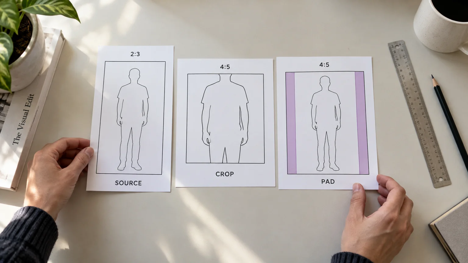
Apply the same framing template to front, back, and side views: shared ratio, comparable subject height, top clearance, shoe baseline, background tone, and hover-image alignment. Model scale depends on subject height and internal padding. Compare the space inside the frame, not just the file dimensions.
Extend the background without rebuilding the garment
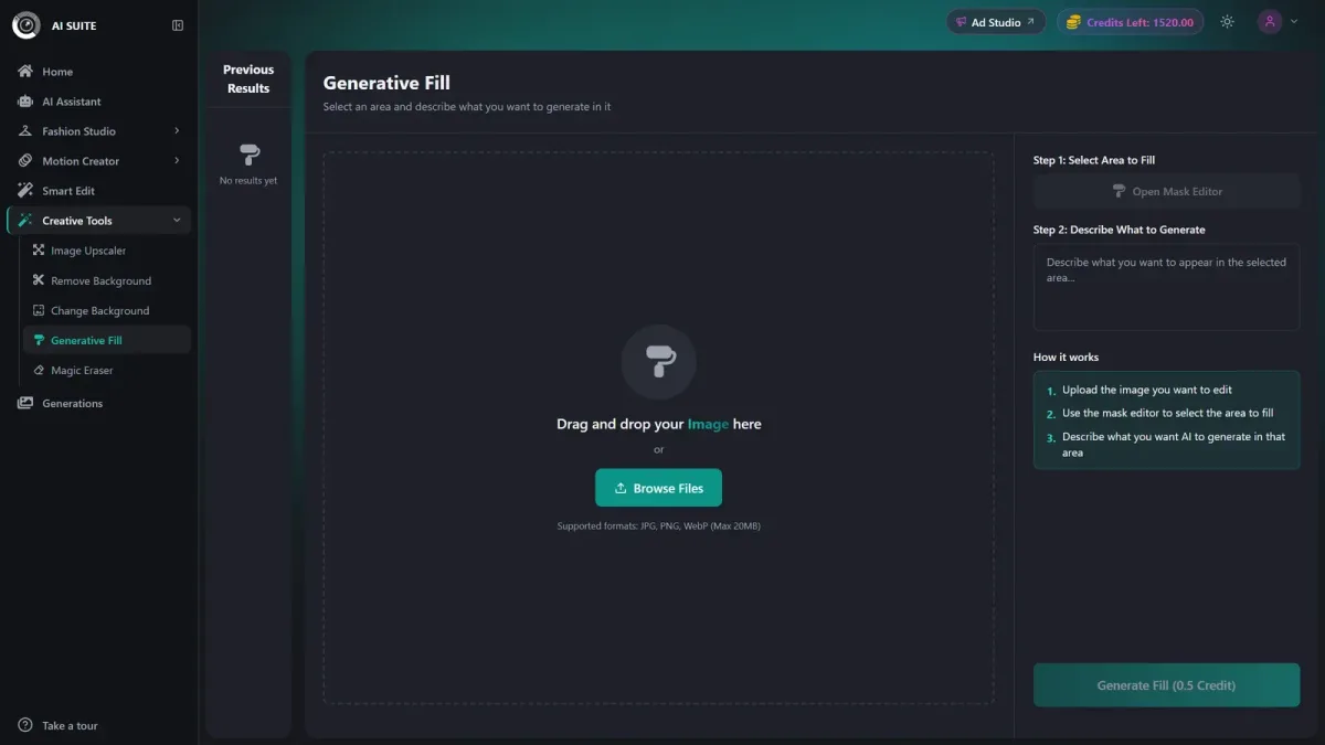
For a plain background, add canvas and manually fill the surrounding space to match. For textured backgrounds, our Generative Fill background extension uses one source image, a brushed mask, and a required text prompt.
Our Generative Fill accepts JPG, PNG, and WebP sources up to 20 MB and offers downloads in those formats. Each fill costs 0.5 credit on paid plans or 1 credit on the free plan; the Generate button shows the exact cost before generation.
Keep the mask outside the garment, then compare seams, fabric, color, silhouette, hands, and shoes with the original. Background extension adds surrounding space; it cannot replace a complete source or reshoot when hems, shoes, or fabric are missing.
4. Export high-quality originals for responsive delivery
Choose the source format
Shopify accepts JPEG, PNG, and WebP product images. Uploading WebP is optional: Shopify automatically selects a supported delivery format.
| Format | Good source use | Watch for |
|---|---|---|
| JPEG | Standard photographic product images | Lossy compression can damage fabric texture; no transparency |
| PNG | Transparency or precise reproduction | Larger photographic files |
| WebP | Compact photographic images; transparency when needed | Lossy exports still need texture inspection |
MDN’s image format guide favors PNG when transparency or precise reproduction matters. Shopify’s image upload guidance advises supplying your best-quality originals and says manual pre-upload compression is unnecessary. Preserve master quality while checking the delivered file against your performance target.
Match delivered dimensions to the screen
One high-quality uploaded source generally serves desktop and mobile. Shopify creates multiple sizes; the theme’s responsive markup determines which version the browser requests.
Device pixel ratio, or DPR, compares physical pixels with CSS pixels, as MDN’s DPR reference explains. Assume DPR 2: a mobile image displayed at 320 CSS pixels needs approximately 640 intrinsic pixels. A desktop image displayed at 800 CSS pixels needs approximately 1600 intrinsic pixels.
| Display | Rendered CSS width | Assumed DPR | Required rendition width |
|---|---|---|---|
| Mobile | 320 CSS pixels | 2 | 640 pixels |
| Desktop | 800 CSS pixels | 2 | 1600 pixels |
At DPR 2, an image displayed 400 CSS pixels wide needs an 800-pixel-wide version to avoid upscaling, as web.dev’s responsive-image guidance explains. Open browser developer tools, select Network, filter for images, reload the page, and inspect the requested image’s dimensions and transferred size. Repeat at mobile and desktop viewport widths. Compare compression levels, following web.dev’s quality guidance, while checking fabric for halos, blockiness, moiré, and lost weave detail.
5–6. Upload a sample and validate the storefront
5. Upload a small sample. Include a full-length garment, a wide-sleeved top, and an accessory or flat lay, plus their hover images.
6. Validate before processing the catalogue. Test collection cards and product galleries independently, on desktop and mobile.
Check sharpness and zoom
Sharp zoom needs genuine source detail, enough delivered pixels, and correctly configured theme behavior. An 800 × 800 image is not a universal Shopify requirement for zoom. Test your theme’s zoom view and fabric-detail rendering.
Inspect stitching, knit texture, prints, logos, color, and garment edges against the original at normal and zoomed sizes. Authentic texture requires sufficient detail in the original capture. GS1 US’s product-image guidance rejects compression artifacts and upward interpolation.
Catch common mistakes before processing the catalogue
Avoid treating square as mandatory, assuming Portrait means 2:3, stretching dimensions independently, mixing hover-image framing, or reducing master quality to meet a delivery target.
- Before upload: confirm ratio, intact garment edges, comparable subject scale, top clearance, shoe baseline, background tone, color, garment fidelity, accepted format, and upload limits.
- On the live storefront: check featured and hover images, mobile grids, product galleries, zoom, and actual network loading behavior.
- If something fails: use a retoucher for local background or edge repairs, reshoot missing authentic detail, and involve a theme developer for unsupported card or zoom behavior.
Use the tested sample as your catalogue standard
Process the catalogue only after the sample passes grid, mobile, gallery, zoom, fidelity, and loading checks. Carry that approved framing brief into your next batch in our creative studio.