
Table of Contents
For fashion product photography, start with white or light-neutral backgrounds for clear main images, as Google Merchant Center recommends. Use color and restrained texture for secondary images and campaigns, where brand expression has more room. The best choice keeps the garment readable wherever the image appears.
Keep the product unchanged: Add this to each background-editing instruction below: Keep the product’s color, silhouette, proportions, hems, seams, logos, print and transparent edges unchanged; preserve its position and perspective.
Product photography background ideas: 1–4, clean studio neutrals
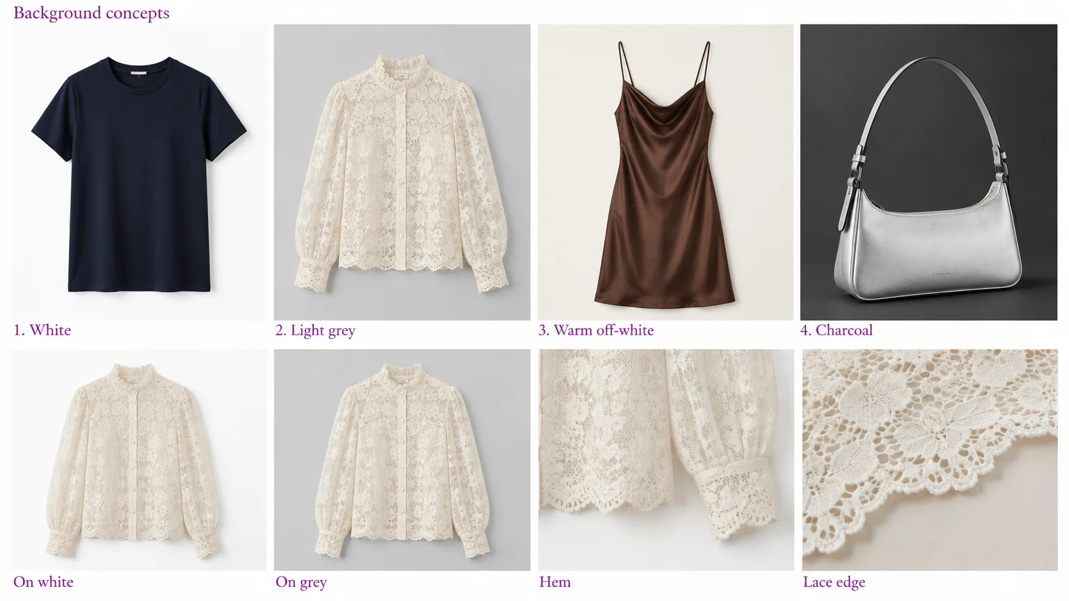
1. Pure-white seamless
A navy cotton T-shirt or colorful sneaker reads clearly against white. Use it for store catalogs and marketplace main images where permitted. Create a paper sweep or use non-glossy white poster board, as suggested in Pocosin Arts’ photography handout. Watch for white hems disappearing into the background.
Scene instruction: Replace only the background with a pure-white seamless sweep and a soft contact shadow that matches the original image.
2. Light-grey seamless
A cream lace blouse, white sneaker or pale bag gains edge separation on smooth light grey. It suits your store’s product grid without adding distracting detail. Use grey paper or painted board, and check that lace openings remain clear rather than becoming filled, blurred or indistinguishable from the background.
Scene instruction: Replace only the background with smooth light grey; retain clear lace openings and a soft shadow that grounds the product.
3. Warm off-white seamless
A chocolate satin slip dress stands out against warm off-white while its folds remain visible. This also suits warm-toned leather accessories on collection pages and branded catalog grids. Use warm-white paper or painted board, but check that cream trims do not merge into the surface.
Scene instruction: Replace only the background with a warm off-white seamless sweep; retain the original light direction and natural contact shadow.
4. Matte charcoal
A pale silver handbag gains contrast against charcoal in secondary images and campaigns. Use matte painted board for light or reflective accessories, and watch for black straps disappearing. For dark leather, prefer a lighter background unless you deliberately light the edges to keep them distinct, as broncolor’s black-on-black demonstration illustrates.
Scene instruction: Replace only the background with matte charcoal; retain every strap edge and the original highlight direction.
5–8: Controlled color and fine studio texture
Color attracts attention without overpowering the product when the outline stays distinct and the palette stays simple. Surrounding hues can alter perceived product color, as Hanover College’s color-contrast explanation describes. Compare cream fabric, stitching and metallic trims with the original image on its neutral background.
5. Single brand-color sweep
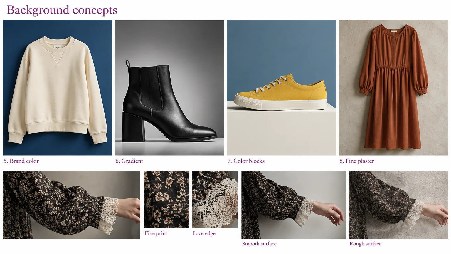
An ivory sweatshirt against muted cobalt creates a recognizable look for social ads or collection banners. Solid garments and bold footwear work well here. Use colored paper or painted board, keeping saturation low enough that it neither makes ivory appear tinted nor competes with multicolored trims.
Scene instruction: Replace only the background with a muted cobalt sweep; preserve ivory fabric color and the original shadow direction.
6. Tonal gradient
A black leather ankle boot reads clearly against a grey gradient with its lighter area behind the outline. Use this for smooth accessories in secondary images and campaigns. Create restrained lighting falloff on a smooth surface, or edit the background. Keep enough contrast around the heel so it does not disappear into darkness.
Scene instruction: Replace only the background with a subtle grey gradient, lighter behind the boot outline, with grounding that matches the original image.
7. Contrasting two-color blocks
A plain yellow sneaker can anchor muted blue and off-white blocks in ads or collection artwork. Keep this treatment for simple products, using paper or painted boards. Avoid boundaries that cross the sole and competing colors that overwhelm patterned uppers or tiny trims.
Scene instruction: Replace only the background with muted blue and off-white blocks; keep boundaries clear of the shoe and preserve its ground plane.
8. Fine plaster studio wall
A plain rust cotton dress suits a fine plaster wall for secondary lifestyle images and campaigns. Use a lightly finished matte wall or plaster-effect board. Subtle texture adds context without props, but roughness can compete with knit loops, lace edges or fine prints.
Scene instruction: Replace only the background with fine, low-contrast plaster; match the original perspective and shadow direction.
9–12: Quiet surfaces and restrained lifestyle settings
9. Low-grain wood
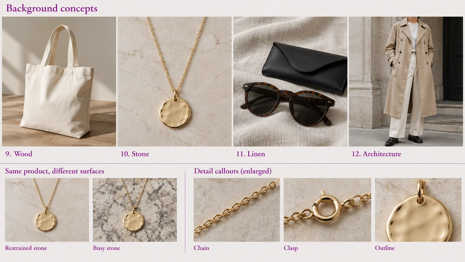
A cream canvas tote looks grounded on pale wood in secondary images and social posts. Subtle grain also suits casual belts and simple footwear. Use a low-grain board, and check that brown straps do not merge with similarly colored grain lines.
Scene instruction: Replace only the background with pale low-grain wood; keep grain subtle and retain the tote’s contact points.
10. Subtly veined stone
A gold pendant needs sparse veining and generous clear space in detail images or campaign crops. This treatment suits jewelry, watches and small structured accessories. Use matte stone-look tile. Keep veins clear of the chain, and watch for invented reflections that misrepresent the surface finish.
Scene instruction: Replace only the background with pale, subtly veined matte stone; keep veins clear of the chain and preserve the original reflections.
11. Smooth linen flat lay
Dark sunglasses and their case stand out on pressed pale linen in editorial flat lays and social posts. Smooth accessories and solid folded garments suit shallow folds. Avoid visible weave that competes with knitwear, lace or fine checks instead of supporting them.
Scene instruction: Replace only the background with smooth pale linen and shallow folds; retain overhead perspective and compact contact shadows.
12. Restrained architectural lifestyle setting
A model wearing a plain trench coat gains context from a quiet stone doorway in secondary lifestyle images and campaigns. Use an uncluttered wall or real setting for structured outfits. Check that the doorway does not cut through the hem, the perspective matches and the feet do not appear to float.
Scene instruction: Replace only the background with a restrained stone doorway; match the original perspective, light direction and foot-contact shadows.
Keep props purposeful. Canon’s lifestyle photography guidance warns that accessories unrelated to the story can create confusion. This matters especially for small products such as jewelry.
Match the background to the garment and sales channel
Choose for product readability first, then for where the image will appear. Use the distraction ratings below to compare options.
| Background | Garment color and finish | Placement | Compatible shadows | Distraction risk |
|---|---|---|---|---|
| Pure white | Dark or saturated; plain, patterned or textured | Catalog; marketplace main where permitted | Soft contact where permitted | Low |
| Light grey | White or cream; lace, knit, matte | Owned-store catalog | Soft, grounded | Low |
| Warm off-white | Dark or warm midtones; cotton, leather, satin | Catalog; collections | Restrained contact shadow | Low |
| Matte charcoal | Pale or metallic; smooth, reflective | Secondary; campaigns | Grounding with visible edge highlights | Medium |
| Brand-color sweep | Separated hue; plain solids | Social ads; collection artwork | Source-matched contact shadow | Medium |
| Tonal gradient | Dark; smooth leather, solid fabrics | Secondary; campaigns | Contact shadow matching gradient lighting | Medium |
| Two-color blocks | Simple solids; low-detail fabrics | Ads; campaigns | Coherent ground plane and direction | High |
| Fine plaster | Distinct tone; plain cotton, simple weaves | Secondary lifestyle; campaigns | Source-matched wall shadow | Medium |
| Low-grain wood | Contrasting tone; canvas, plain leather | Secondary; social | Surface-following contact shadow | Medium |
| Subtly veined stone | Distinct metal or accessory color; polished, structured | Details; campaigns | Compact contact; consistent reflections | Medium |
| Smooth linen | Contrasting solids; smooth accessories, folded garments | Editorial flat lays; social | Shallow overhead contact shadows | Medium |
| Architecture | Distinct from surroundings; structured outerwear | Secondary lifestyle; campaigns | Perspective-matched foot and wall shadows | High |
- Marketplace main images: follow the destination’s current rules. A visually suitable background still needs to meet those requirements.
- Owned-store catalogs: prioritize repeatable crops, scale and readable details.
- Secondary lifestyle images: add context without suggesting unrelated props are included.
- Campaign creatives: allow stronger color and composition while keeping the product dominant.
Catalog images and social ads need not share an identical background. Repeat a controlled color family, surface and shadow treatment instead, adapting the tone when hems or straps disappear.
Record your catalog background settings
Background color: note the chosen neutral or brand color.
Texture scale: specify smooth or fine, low-contrast texture.
Crop and aspect ratio: record the selected crop and ratio.
Product position: note its position within the frame.
Light direction: record the original light direction.
Contact-shadow softness and density: describe the original shadow.
For the wider capture process, use our ecommerce product photography guide.
Optional: Change only the background with Smart Edit
To change a background with our Smart Edit photo editor, request a background-only edit and compare the result directly with the original:
- Upload a photograph you have permission to use: JPG, PNG or WebP, up to 10 MB each. Use a photograph you own or have permission to adapt for your intended commercial use.
- Select Nano Banana 2: the default is GPT Image 2.
- Paste a scene instruction: add the product-preservation instruction from the start of the article.
- Set the composition: choose a supported aspect ratio, such as 1:1 for a square catalog image.
- Choose output settings: Nano Banana 2 supports 1K, 2K and 4K, with up to two outputs per run. Nano Banana 2 Lite is separate, with fixed 1024px output.
- Generate and inspect side by side: check color, silhouette, hems, seams, logos, prints, transparent edges, perspective, contact shadows and reflections.
Keep light direction and grounding consistent. Soles, feet and flat-lay edges should meet the surface. Reflections must suit its finish: broncolor’s white-on-white example demonstrates how retaining a reflection preserves surface contact. Reject results with changed garments or lost details; revise the request or keep the original.
For Merchant Center submissions, ensure generative-AI images contain the origin metadata required by Google Merchant Center’s image requirements.
Frequently asked questions
Which background helps white or cream clothing stand out?
Smooth light grey helps white or cream clothing stand out by separating pale hems and edges from the background. Check lace openings and cream trims closely, especially at listing-thumbnail size.
What background works for black garments and dark leather?
White, light grey or a restrained grey gradient gives black garments and dark leather clear separation. With a gradient, keep the lighter area behind the darkest product edges so heels, straps and hems remain visible.
Which background textures work with knitwear, lace and satin?
Smooth backgrounds keep knit loops and lace edges readable, while a quiet neutral lets satin folds remain visible. Fine plaster, linen weave and strong wood grain can compete with detailed fabrics, so compare those details at thumbnail size before choosing a textured surface.
How do I keep shadows believable after replacing a background?
Match the original light direction, perspective and contact points so the product remains grounded. Check that soles, feet and flat-lay edges meet the surface, and keep reflections consistent with the new surface finish. Reject versions with floating edges or conflicting shadows.
Should I export a transparent cutout or an image with the background included?
Export a transparent cutout when you need to place the product into another design; include the background when the image is ready for its final listing or ad. Follow the destination’s file and background requirements, and check edges and grounding in the finished composition.
Do I need permission to use a location photograph as an AI background?
Use a photograph you own or have permission to adapt for your intended commercial use. Check any license terms before uploading it to an AI tool, and choose another image if those terms do not cover your use.
Choose the quietest background that does the job
- Confirm where the image will appear and check the current image rules.
- Check hems, straps, lace and accessories at thumbnail size.
- Keep color and texture subordinate to the product.
- Match perspective, contact shadows and reflections.
- Record the treatment and compare the finished image with the original.
Choose the look first. If editing is the right route, apply it with our Smart Edit photo editor.